Monday, January 31, 2011

Sweet Summer Sale-A-Bration Gift Box

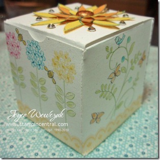
I want to clear up any confusion regarding the box I created for this past week-ends blog hop.  I apologize if I led anyone to think that the template for this box was included on the SAB Digital Content CD.  The CD contains only the new items in the SAB catalog:  So Happy For You, Punch Bunch, Ice Cream Parlor DSP & Quick Accents Pack, Ice Cream Parlor Ribbon & Button Pack, Sweet Summer, Notes décor elements, Bliss.  The box template I used is an add-on for the My Digital Software program and is sold seperatly: Mini Project Boxes - Item # 120171 which sells for  $1.95 and contains 2 mini project boxes. 

sab box a2

In order to create this cute little box, I went through several steps.  None were time consuming at all, the entire design process came together in about 10 minutes – then all I had to do was print, cut, color and tape.

sab box_2_2_2-002a

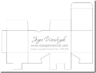
I started by selecting the multiple output option and a blank landscape 8 1/2” x 11” canvas area.  I found the Mini Project Boxes in the Designer Kits section of the Stamps area.  This box is mini box #1.  When I applied it to my project I had to rotate it right and then select mirror.  It then looked like the photo above and I was ready to “stamp” away.

sab box_2-001 (2)b

The template gave me a nice idea of where to begin my design and what the end result would be like.  I used various stamps in the Sweet Summer set, placing, coloring and resizing as necessary until I had my desired result.  I rotated and resized the butterflies, bees and bird so they would fit into the tiny spaces.

sab box_2-001b

When I had it all completed, I highlighted the original box template stamp and selected “remove” from the options.  This allowed me to print it out without having my cut and scoring lines printing onto my design.  At this point I printed it onto copy paper so I could check out alignment issues in the next step.

sab box_2-002b

Now I needed to get that wonderful box template to print on the reverse side of my cardstock.  I added a new page to my project, again selected the Mini Project Box #1 stamp, rotated, mirrored and then selected “flip”.  I printed on the reverse side of the copy paper I used in the previous step, held it up to a light and I could see exactly where my design was going to fall when I actually printed it on cardstock.  I did have to go and make a minor adjustment to my stamps – easily accomplished by using the Arrange menu and “select all” – then my arrow keys on the keyboard to slightly move all the items at the same time.  I inserted my cardstock, and printed only the template page first.  Then reinserted my cardstock to print my designed area on the reverse side (try to remember if the right or left side of the page prints first so your alignment is correct).

You could also just print the template onto copy paper and use temporary adhesive to apply it to the back of the cardstock you printed the design area on – then cut.  I like having it right on my cardstock, it’s just a personal preference.

sab box_2_2_2-003a

My last step was to create the flowers for the lid of my box.  Once again I added a new page to my project.  I went back to the page of my original design, selected the flower I had stamped on the lid and copied it (edit menu – copy).  Then back to my new page and pasted it (edit menu – paste).  I pasted three copies of this stamp, then moved them into one row and printed onto copy paper.  Using the Dotto temporary adhesive I adhered colored cardstock over the images on the copy paper, reinserted into my printer and printed this page only.  My multiple flower layers were now printed on cardstock and ready to cut and put together.

I hope I haven’t totally confused you with my instructions.  This really is a quick, easy and fun project to complete!


Friday, January 28, 2011

Stampin’ Addicts 2011 Sale-A-Bration Hop


SAB_Blog_Hop_Banner

Welcome to Stampin’ Addicts Sale-a-Bration blog hop, I am the 4th stop along your journey.  There are 21 talented stampers on this tour, all are eagerly awaiting your arrival so they can share with you some of the wonderful products that you can earn for FREE during Stampin’ Up!’s Sale-a-Bration promotion.  If you started at the beginning of the tour, you have just seen the bright and cheery creations Twila created using the fun Ice Cream Parlor Designer Paper & Quick Accents Pack.  If you are starting the tour with me, you can continue on to visit all participants by using the link at the end of my post.  If you get lost anywhere along the way don’t worry, you can find links to all the stops on the Stampin’ Addicts website. 

I was so excited when I saw the Digital Content CD offered in the Sale-a-Bration catalog.  What a great way to have access to all the new stamps, Designer Papers, ribbon, buttons … well … EVERYTHING!  Did you see the Décor elements chalkboard piece on page 9 of the catalog?  Guess what?  With the digital CD, you are not limited to only hanging it on a wall and using chalk.   The individual elements are available on the CD as separate stamps!  sab journal a2

When I saw this I knew I was going to have fun with it.  I decided to make a cute journal, complete with lined paper inside.  In addition to the Chalkboard elements, I added paper, borders and an accent from the Ice Cream Parlor set; and a few buttons for good measure.  You may have noticed that the colors of my notebook are not as bright as those in the paper pack.  By creating this with the My Digital Studio software, I was able to lower the opacity and get lighter color tones.  I can also submit this to the printer through the software program and have it professionally printed as a hard-bound journal.  How fun is that!

While I was wandering around the software program, I stumbled on a template for a box and wanted to see what I could do with it.  sab box a2I decided to use the Sweet Summer set this time.  The cute border at the bottom of the box is once again from the Ice Cream Parlor Quick Accents.  When I was done with placing all my items where I wanted them, I printed it out.  The majority of the coloring was done with a blender pen, markers were used for the center of the flower blossoms and the bees.  A few strategically placed pieces of sticky tape and it turned into a beautiful little gift box!  sab box lid a2

Here’s a closer look at the larger flower on the lid of the box.  This was printed out on scraps of colored cardstock and the individual layers cut out.  I topped it with a glimmer brad, and surrounded it with lots of bling!


For my last project I decided to play with the Bliss stamp set and make a hybrid card.  Believe it or not, I do not yet have this stamp set in my possession … all images were created using the Digital Content CD!  It is one layer printed on Very Vanilla cardstock, which I trimmed and mounted to an Early Espresso card base.  I’ve found that one of the greatest perks of using the My Digital Software program is that you aren’t limited to using a stamp in just one size.  If you look closely at this card you will see that the background is the same stamp as the main image – just scaled much smaller.  I also lowered the opacity of the back panel so I could achieve a tone-on-tone designer paper look. 

sab bliss a2

Thanks for sitting with me and letting me share my creations with you.  I hope you enjoyed these projects as much as I did making them!  Follow the arrows below to continue on the tour.  Your next stop is Sarah’s Ink Spot, where Sarah is going to share her gorgeous creations using the Sweet Summer set (yes, I have peeked already!).


Previous_Button_Very_Small     Next_Button_Very_Small


Wednesday, January 12, 2011

Sidetracked Valentine

I have decided that I am my own worst enemy, I’m getting sidetracked way too easily lately.  Yesterday I found some time to escape into my stampin’ quarters with every intention of getting things in order so I could post details and photos regarding the butterfly card I made last week.  In order to accomplish this task it meant I had to first clean up another pile of stuff that managed to get shoved on my desk.  Oh my, all that stuff just happened to be the latest order of new toys I decided I just couldn’t live without.  Here’s where I get in trouble, a little peak into how my brain works (or doesn’t, you decide):  “I better first sort through the box to make sure this order is correct” … “Ok, now put this pile away so you have a place to work” … “oh wait, maybe I’ll quickly mount just this one stamp set”.   I’m sure you’ve already figured out where the brain takes me next … “I’ll just play a little bit, the butterflies will wait”.  Yup, they are still waiting – I was having so much fun that I totally lost track of time.

P1120007b

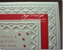
This is what my playtime resulted in (along with another mess – it’s a vicious circle).  I have now decided that the Framed Tulips embossing folder from Stampin’ Up! is my new BFF!  I love that with a few runs through the Big Shot and minor placement adjustments, this frame can be used on almost any layer size.

P1120001b

If you look closely, you can see that the main image panel is using the debossed side of the cardstock.  I think it looks as beautiful as the intended embossed side!  Many thanks to Sharon Field for her wonderful tutorial on how to accomplish this!

Once again, I chose to let this elegant frame speak for itself and not clutter things up too much.  I used the Valentine definition stamp and surrounded it with some free-floating hearts.  Those tiny little hearts were the scrap pieces left behind from using the Pinking Hearts border punch on the bottom of the red panel, scattered randomly and affixed with a very small dot of Tombow multi-purpose glue. They were laying all over my desk and I really hate throwing away perfectly good paper, figured I should use them for something!

PROJECT RECIPE:

Stamps:  Valentine Defined
Paper:  Naturals White, Real Red
Ink:  Real Red
Accessories:  Framed Tulips embossing folder, Big Shot, Pinking Hearts border punch


Friday, January 7, 2011

Vintage Puffy Heart

The cold temps here in Chicago-land are keeping me inside once again – not that I get out much anyway (my children will confirm this little tidbit of information), but now I don’t WANT to leave the warm refuge of my home and at least have an excuse that others understand. <grin> 

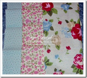
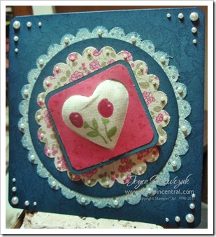
I’ve finally found a little shred of “quiet time” and am going to share details of one of my projects from last weeks blog tour.  P1070001bAs previously noted, my task was to play with showcase the Springtime Vintage Designer Fabric line available now in Stampin’ Up!’s new Occasions Mini Catalog.  I adore the bright cheerfulness of the colors, as well as the variation of fabric designs.  In each package you will receive these three beautifully coordinated 100% cotton fabrics, each piece measuring 28” x 18”.  That’s a whole lot of fun all wrapped up in one little package!

I know you’ve seen this photo before, but I like this card so much I just couldn’t resist posting it again. <hehehehe>  To make the two scallop circles I cut a square of each of the fabric designs I wanted to use and applied them to a sheet of Big Shot Multipurpose Adhesive paper.  I took my trusty bone folder and applied pressure over the entire pieces to make sure the adhesive stuck well.  So I wouldn’t gunk up my paper snips or other good scissors, I used my craft/rubber scissors to cut those out and ran the pieces through the Big Shot using various scallop circle die cuts – resulting in perfectly cut fabric swatches!  

PC300009b

I decided on a 5” square card and stamped the base layer with a background stamp, then sponged the edges for more of a vintage feel.  I very lightly sponged the edges of my largest scalloped circle fabric piece, removed the backing paper and applied it directly to the card base, again using the bone folder to make sure it adhered well … layered a circle cut from cardstock … then another scallop circle cut from fabric using the same process as above.  A bit of unsolicited advice when doing this (sure wish I would have thought of this procedure first) – only remove a small corner of the backing paper and start positioning your die cut, remove more of the backing and smooth the fabric as you go.  This way you will get your piece affixed exactly where you want it with no creases, folds or bumps.

P1040002b

The dimension on this heart was hard to capture in a photo, it pops up about 1/4”.  To achieve this I started by finding a portion of the fabric piece I wanted for my focal point – I loved the two little flower blooms, cut a small square of that section of fabric.  I then cut a piece of card stock and punched a heart in the center, turned this piece over and applied snail adhesive around the edges.  I began sticking my fabric to the adhesive, pushing a bit of the fabric through the heart as I went.  When I was happy with the results, I ripped apart and stretched a cotton ball, smooshed those pieces into the fabric from the reverse side until the heart was puffed out – then attached it to another layer of coordinating card stock.  I had a few spots that weren’t sticking well, so I used a very tiny bit of Tombow Multipurpose Liquid Glue and applied pressure for a few moments.  The resulting piece was popped onto the center of the card using dimensionals which I double stacked for extra “lift”.

Lots and lots of Basic Pearls were used to finish this card off.  I deliberately chose not to use a sentiment, thought I’d just let the card speak for itself!

Project Recipe:

Stamps:  Bella Toile background, Wonderfully Worn background, Confetti background
Cardstock:  Not Quite Navy, Rose Red
Ink:  Not Quite Navy, Rose Red
Accessories:  Big Shot, Scallop Circle die, Scallop Circle #2 die, Clear Circle die, Full Heart punch, Corner Rounder punch, Multipurpose Adhesive Sheets, Basic Pearls, cotton ball, adhesive, dimensionals


Related Posts Plugin for WordPress, Blogger...